
Since 1988, Open Hand Atlanta has delivered love, dignity and nutrition to neighbors in need.
Today, our work remains the same, but we are excited to announce a meaningful update to modernize our brand as we look toward an exciting future. Importantly, the update also evolves the Open Hand and Good Measure Meal brands to be more connected, differentiated and modern…while still honoring their incredible legacies. 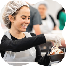
Our team worked with Matchstic, an Atlanta-based branding and design agency, to ensure that our brand aligns with our mission and core values. After hours of dialogue
around our brand identity, we believe the images and aesthetic you see today represent who we are to our core – neighbors helping neighbors through delicious, nutritious, home-delivered meals.
Our new visual identity is a unified system comprising core elements (logo, typography, and color, as well as graphic elements and photography.) Together, we believe these elements visually tell the story of who we are.
Logo
 The new brand symbol is a bold expression of the warmth and love that motivates everything we do at Open Hand. The two hands coming together represent Open Hand’s personal impact delivering nourishing meals and nutrition education to neighbors in need. Its circular motion suggests continued care and nutrition education. Its organic, friendly forms suggest delight, convenience, love and care. And, it has a subtle “O” shape, which reinforces our name.
Both the Open Hand and Good Measure Meals logos will now share the same brand symbol. This more clearly connects Good Measure Meals as the social enterprise that helps fund Open Hand’s mission. All our meals are the same. The hands coming together can also represent how Good Measure Meals’ customers make an impact on neighbors in need with every purchase.
Font
The font we selected is called Bagoss. It features characteristics that feel punchy and flavorsome, friendly and effortless. It is warm and satisfying...just like our meals!
Colors
While our primary colors are still grounded in the green family, we are expanding our color palette to better reflect the rainbow of fresh food we serve our clients. Each color in our palette is designed to work with food photography. Our colors are aptly named after the foods they represent: arugula, basil, cucumber, oat, carrot, tomato, plum, and onion.
Visual System
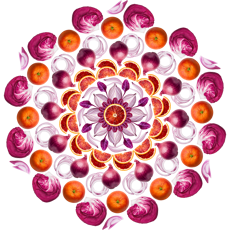
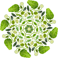
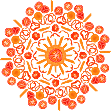
Above all, we knew that our new brand needed to look delicious--like our food! Using beautiful photography of fresh ingredients to create kaleidoscope art, we created a stunning visual system that illustrates what sets Open Hand and Good Measure Meals![]() apart: our high quality food and nutritional standards. Our on-staff team of registered dietitian nutritionists ensure our ingredients are of the highest quality. Our new visual system does the same!
apart: our high quality food and nutritional standards. Our on-staff team of registered dietitian nutritionists ensure our ingredients are of the highest quality. Our new visual system does the same!
Together, we believe these elements visually tell the story of who we are. We believe food is love and food is medicine.
As one of the nation’s largest and most prominent community-based providers of healthy, home-delivered meals and nutrition education, Open Hand has a dedicated staff, an army of compassionate volunteers, and the support of dozens of community partners. Today, Open Hand prepares and delivers 5,000 meals each day to more than 4,500 of our medically-fragile neighbors and empowers 3,000 clients annually to take control of their health through nutrition education. And the need for Open Hand’s expertise continues to grow.
Our updated visual identity is an important part of our path forward to making our meals and nutrition education services more easily accessible to those who need them.
